Top 15 Data Visualization Examples of 2025
Data visualization examples can help you make sense of a lot of information. here’s a visualization that shows where the world’s population growth will take place over the next century.
We’ve gathered some of our favorite examples of data visualization from around the web, so you can get inspired and think about how it applies to your brand.
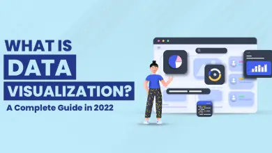
What is Data Visualization?
It is a process of creating a representation of data that is not just textual or numeric but also intuitive and easy to understand. Data Visualization allows the audience to see a large set of information at one glance. And it makes decisions based on what they see quickly.
In this post, we will cover several aspects including top data visualization examples and interesting use cases.
Best Leading Data Visualization Examples
1. Facebook Likes Map
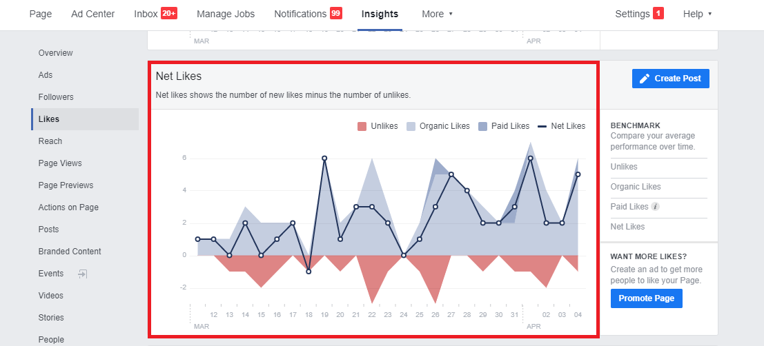
A Facebook map can be made using the data from your Facebook account. This includes personal information, location tracking, and even your interests. You can use this data to create a visual representation of where you live and how you feel about it by using a map or simply listing what you like from A-Z.
For example, I live in India and I love art museums so I made a Facebook map that shows every museum I’ve been to in India as well as my favorite pieces of art there. Alternatively, if you want to make something more complex than just listing out your likes then try making a heatmap based on them instead!
If you don’t have access to any raw data then consider using an API such as Google’s Distance Matrix API which will allow users who don’t have any knowledge about coding themselves but still want results quickly – especially when trying out new ideas before committing resources towards building them into real applications later down the line.”
2. Spotify Music Map
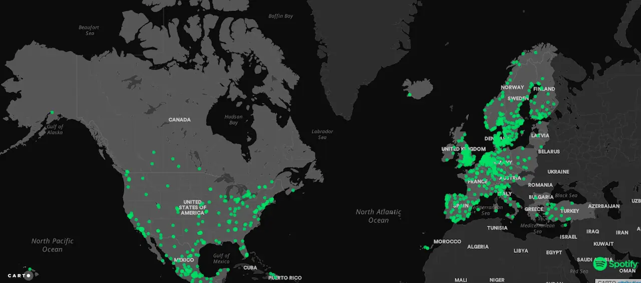
Spotify is a music streaming service. It has gained more than 140 million active users. The company possesses a data visualizing tool called Music Map. This tool helps you explore music popularity by showing you which songs are most popular in different countries. You can also filter this information by genre and year, or even see how tracks are trending on certain days of the week.
Spotify’s Music Map is an excellent data visualization because it uses visual elements to tell an engaging story about its subject matter music preferences around the world and it makes it easy for users to navigate through different areas on the map.

3. The Age of Information
A great data visualization examples can be found in the Age of Information, created by John Nelson. This visualization depicts the internet as a city, with buildings representing major websites and streets representing links between them.
The visualization was created using Google Earth and won an award for best use of maps in 2006. Many different colored buildings give you a sense of what kind of content is located within each website.
For instance, white houses represent informational websites like Wikipedia while yellow houses represent shopping sites like Amazon or eBay. This is one of the best data visualizations out there because it tells such a simple story: there are billions of pages on the internet and they all link back to each other somehow!
4. The History of the World Since 1300 AD
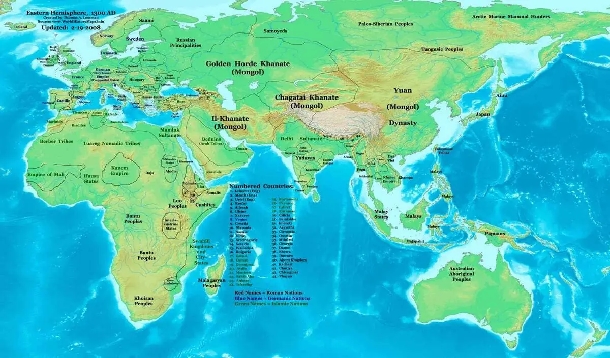
The History of the World Since 1300 AD is a visualization of the history of the world from 1300 to the present day. It was created by a media agency and features several interesting facts about world history.
It includes timelines for specific events, causes behind social movements, and changes in population size. The interactive visualization allows you to explore these trends over time by filtering them by category or decade.
5. Google Analytics Dashboard
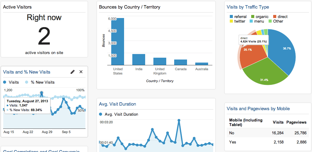
Google Analytics Dashboard is a free web analytics tool that provides you with detailed statistics about your website traffic, including which parts of your website are most popular and how long visitors stay on each page.
It’s completely customizable, making it easy to see the information you want to see to help improve your website.
6. Blockchain Technology World Visualization
Blockchain technology is a distributed ledger used to record transactions. The blockchain has a consistently growing list of records, called blocks. They are linked and secured using cryptography.
Each block comprises a cryptographic hash of the previous block, a timestamp, and transaction data. By design, blockchains are innately resistant to modifying the data. Once data is recorded, it cannot be altered retroactively without redoing the proof work. It requires reaching a consensus on that block again.
The blockchain contains all sorts of interesting information about different types of transactions but what I find most interesting about it is its immutability: once something has been recorded onto the blockchain, it will always be there for eternity (as long as nobody tries destroying all copies).
7. Mental Health User Journey Experience Map
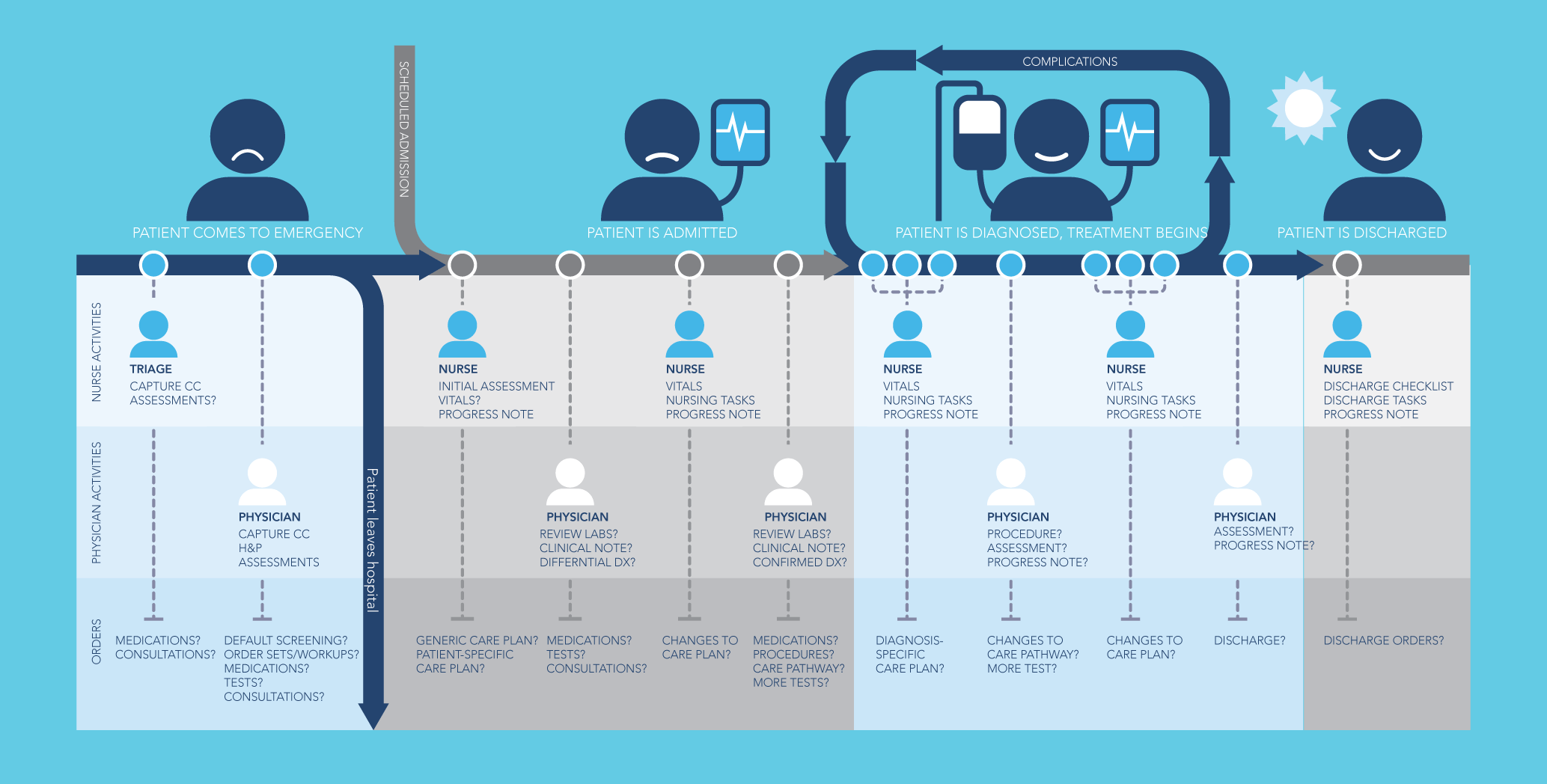
As you can see, mental health is a serious issue that affects people all over the world. Too often, it goes undiscussed and misunderstood for lack of education about its nuances and complexities.
Whether you’re looking for ways to help someone who has struggled with mental illness or want to learn more about the condition yourself, this data visualization tool provides an excellent starting point.
The interactive map allows users to click through different sections of the brain and explore how they relate to specific symptoms.
Each section includes information on how long it takes for each symptom to develop into another one; whether there are any warning signs; how common it is among different populations; what treatments work best in helping reduce or manage those symptoms; etcetera!
You can also click on individual countries around the globe where users live this will provide even more insight into what those places might have been like before experiencing new ones that were introduced there later down their journey so far.”
8. Microsoft Power BI Data Visualization Examples
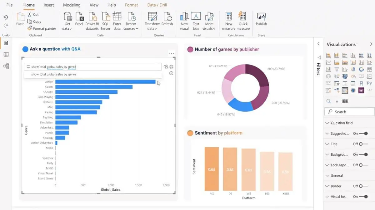
Power BI is a cloud-based business analytics service. It allows users to create interactive visualizations, dashboards, and reports from their organization’s database. The platform also allows users to publish to the web and share reports with others outside of the organization.
In 2018, Microsoft released Power BI Desktop an app for creating reports using Excel by connecting it to an online data source such as SQL Server Analysis Services or AWS Redshift/DataLake Analytics/BigQuery/Google BigQuery.
And Power Query add-ins for both Excel and Access databases allow users to automate tasks such as extracting data from various sources into spreadsheets or other collections of information such as email inboxes or social media feeds.
9. NASA Mars Exploration Program Dashboards and Data Visualizations
NASA has been helping us learn about the universe for decades now. Their data visualizations are on a whole other level when it comes to making information understandable and easy to understand. Recently, NASA released some amazing data visualizations that show how their Mars Exploration Program is going.
10. Water Consumption
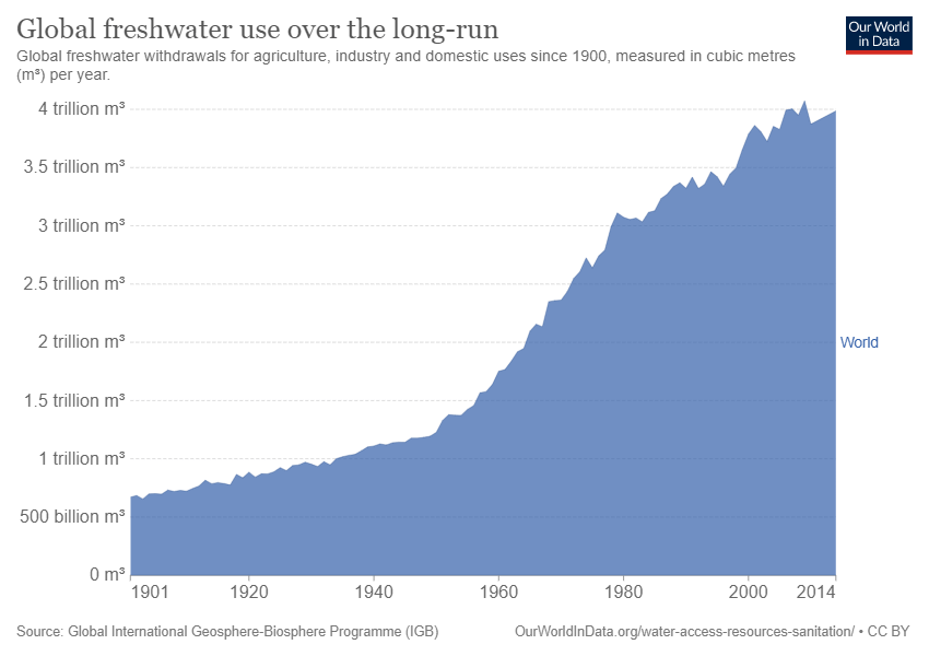
Water consumption is a topic that may not be immediately obvious, but it’s important to understand how much water we use as a country and what we use it for. This can help us better manage our resources and improve our communities by using them more efficiently. Here are some common questions about water consumption.
- How much does the average person in the U.S. use per day?
- How much does the average person in the U.S. use in a year?
- How much water is used to produce a gallon of milk?
- How much water is used to produce a gallon of beer?
11. Plastic Waste Pollution
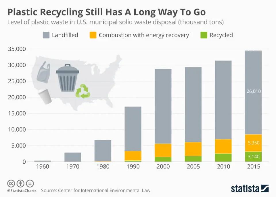
Plastic pollution is nowadays a global problem. And it’s one that we must be aware of. Not only is plastic killing marine life, but it’s also causing human health problems. The costs of cleaning up plastic waste are expected to cost $1 trillion by 2030!
12. Icebergs and Weather Change
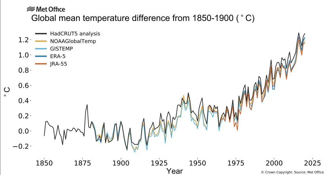
Data visualization can help people understand complex issues. One example is climate change and icebergs, which have a direct effect on each other. Visualizing data can help people better understand this relationship by making it easier to see how much of the Earth’s surface is covered in ice at any given time.
By looking at data on icebergs and climate change across the years, you can get an idea of how they’ve been affected by rising temperatures and what those effects might be in the future.
13. Visualizing Pandemic History
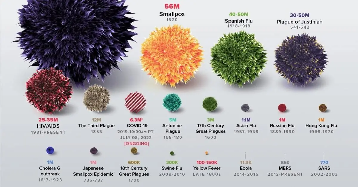
A pandemic is a disease that spreads rapidly and affects people in multiple places. You can use data visualizations to see what is happening with pandemics. Data visualization examples help people understand the history of pandemics.
When you use data to visualize pandemics, you can see what has happened in the past and how people reacted to it. You can also see where the most serious outbreaks have occurred and where they are likely to occur in the future.
You can see which countries have been affected by a pandemic and which ones are likely to be affected in the future. This helps you understand how much of a risk there is for an outbreak in your area or country.
14. Fossil Fuels
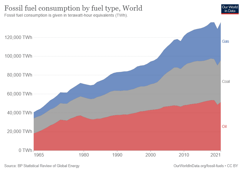
Fossil fuels, as we know them, are finite resources. Despite their vast supply and high-quality energy output, they cannot be replenished at the rate that we use them. And yet fossil fuels continue to be our primary source of energy in the world today in fact, they account for nearly 80 percent of all electricity generated globally (a statistic that’s been consistent since 1990).
These resources have contributed greatly to human development over time and will continue to do so until something better comes along. However, there are some major downsides to this dominance.
- They contribute significantly to climate change through greenhouse gas emissions.
- They also produce air pollution that causes respiratory disease and cancer.
- Water pollution from fossil fuel extraction processes can lead directly into drinking water sources if remediation efforts aren’t put in place first.
15. Help Businesses Understand Complex Issues
Data visualization can be a powerful way to help people understand complex issues. Data literacy is becoming increasingly important in society, as people are faced with increasing amounts of data and new ways to use it every day.
Visualizing data can play a key role in helping us see these trends, especially if they’re communicated clearly and simply. A well-designed data visualization helps decision-makers see their options more clearly than before. It also allows them to make informed choices based on real information rather than guesswork or hearsay.
They allow businesses and organizations to communicate better with customers by providing clear visual representations of their products or services instead of just abstract numbers on the page or screen.

Conclusion
In nutshell, data visualization is a perfect way to make complex information easier to understand. It helps people make informed decisions and solve even tough problems in their daily lives. Data visualization examples are also useful for businesses, as they allow them to analyze their performance and plan accordingly.
We’ve seen some great data visualization examples of this in the past few years, but there are many more to come as data becomes more accessible and easier for anyone to share their findings with others. The end goal is for everyone to be able to have access to the same information so that we can use it as a tool for change not just in our own lives but also on a global scale.
FAQs for Data Visualization
Data visualization is the process of visualizing data to communicate information effectively. It’s a form of communication that allows you to represent data in a way that is easier to understand and interpret, even if you don’t know how to code.
You can use it for many purposes: communicating data, analyzing trends, making decisions based on existing information, finding patterns and outliers, etc.
It is a process that uses the visual representation of data to communicate information. Visualization helps you see and understand your data better so that you can make decisions based on it.
Data visualization is one of the best ways to communicate information. It allows your end users or target audience to quickly understand what they’re looking at.
A good example of this would be pie charts, which show how different parts contribute to a whole in an easy-to-understand way.
Data is a company’s most valuable asset. It’s the fuel that powers the engine of modern business, and it’s also the raw material companies use to create new products and services.
Data visualization is an especially powerful way to understand your data because it allows you to see patterns, trends, and anomalies that you might not be able to spot in a simple Excel spreadsheet or database table.
Data visualization helps you uncover insights about your customers’ behaviour so that you can improve how your company delivers value for them and ultimately make more money in return.
You can explore these visualizations in more detail below.
Charts and graphs show data with a visual representation. They’re most often used to compare parts of a dataset or show trends over time. Examples include line charts, scatterplots, bar charts, and pie charts.
Maps show spatial information about a location or area of interest on the Earth’s surface. A map may also be used for visualization of other physical spaces such as oceans or the moon’s surface.
Tables present numerical data in rows and columns. It helps understand references and comparison purposes quickly. They can also be used to display categorical data (eg. gender) using columns that are divided into categories (male/female).
Scatterplots are graphic representations where each point represents an observation while two or three variables are plotted against one another.
They can help you visualize how two variables interact with each other over time by forming trends in your results, which is why they’re commonly used by scientists!
Visualizations can be used to find insights that you can use to make better decisions. For example, if you want to know what motivates your customers and employees, a visualization of sales data will help you understand which factors are most important in driving revenue.
Once you have identified these key drivers, it is possible for visualization of sales data visualized through dashboards and reports (using Excel) could show how different aspects of your product or service affect customer satisfaction scores.
Once again, this information will help generate more revenue by helping identify areas where improvements need to be implemented.
Visualization tools also allow even novice users such as marketers who aren’t familiar with analytics software like Excel spreadsheets. It is easier to visualize their data without needing expensive training courses or hiring a data consultant every time they want new insights into their business operations.
The first step is to find the right data. This might be easy if you work in an organization that already collects data of interest, but it can also be a challenge if your company doesn’t yet have a system for collecting and storing the information you need.
The second step is to create the right visualizations to communicate those insights. You’ll have to make sure that all of your visualizations take advantage of their most important features (e.g., size, colour) so that they’re clear and easy on the eyes.
Finally, make sure all of your visualizations are accessible to people who don’t necessarily know what they’re looking at!
Data visualization skills: You’ll need to be able to translate data into meaningful visualizations that are easy for your audience to understand.
Data analysis skills: You’ll also need the ability to take raw data and organize it in a way that provides context or answers questions, rather than just reporting out numbers.
Programming skills: A background in programming will help you automate tasks like creating charts or graphs, which can save time when you’re working with large amounts of data sets and large audiences (like an entire organization).
Communication skills and business acumen: They are also important especially when communicating findings from analyses back up through stakeholders whose sole job function isn’t related specifically to analyzing data!