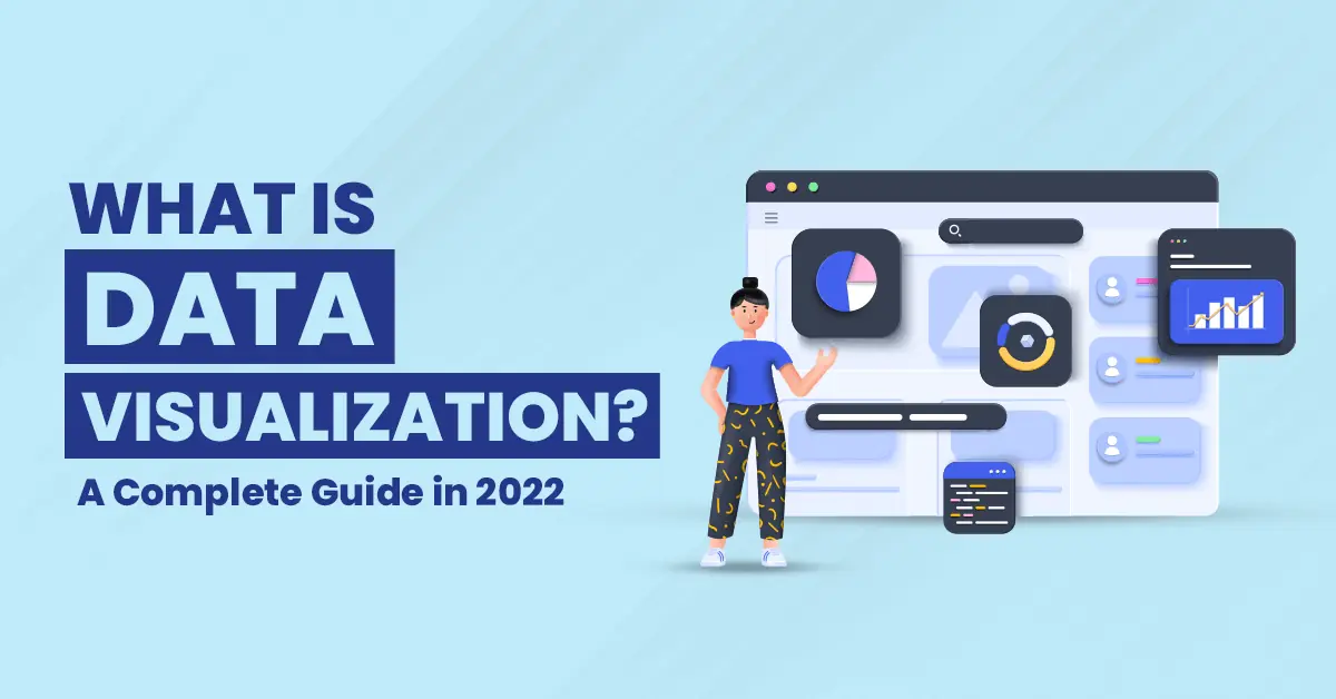
What is Data Visualization? A Complete Guide in 2025
Data visualization is a rapidly evolving field and one that we’re pretty excited about. Since the first time someone put a bar chart on paper, we’ve been using data visualization to help us understand the world around us. And now that we have more data than ever before, those skills are more valuable than ever.
What is Data Visualization?
Data visualization is the presentation of data in a graphic format. It’s a way to communicate information that helps people see patterns and trends, and it can be used for anything from simple graphs to complex network diagrams.
The goal of data visualization is not just to create pretty pictures it’s about helping people understand complicated data. Data visualization allows us to connect with the world around us, allowing us to make sense of an overwhelming amount of information by making it more accessible, understandable, and usable.

History of Data Visualization
The early 1990s saw the emergence of personal computers that made it possible for people to work with data. As a result, there was a surge in the number of people who could visualize data for themselves. There are several reasons why people choose to visualize their data.
- It’s fun. We like to play. We like things that are colorful and interesting, even if they don’t mean much from an analytical point of view!
- People want to make sense of large complex systems by looking at them visually (i.e., seeing patterns). This is called “pattern recognition,” which is one way to show how our brains work.
With the advent of big data, Sparklines was created by Edward Tufte in 2003 to show how a simple word-sized graphic could represent complex information without taking up much space.
Sparklines are tiny, word-sized graphics that can be embedded in the text. They are used to show trends in data. For example, if you want to show how many users your company has daily, then you would use a sparkline graph.
Sparklines are very useful in situations where there is limited space and large amounts of data need to be presented quickly. They give insights into the big picture while also providing specific details about different sections within that overall picture.
In 2007, IBM released Many Eyes. It was an interactive visualization tool that allowed public collaboration. The platform allowed users to create and share data visualizations in a way that was easy for anyone to access and understand data. It was discontinued in 2015 but is considered a predecessor to IBM Watson Analytics.
Many Eyes has been replaced by Tableau Public as the go-to tool for creating and sharing charts publicly on digital channels like LinkedIn or Facebook, etc.
Types of Data Visualization
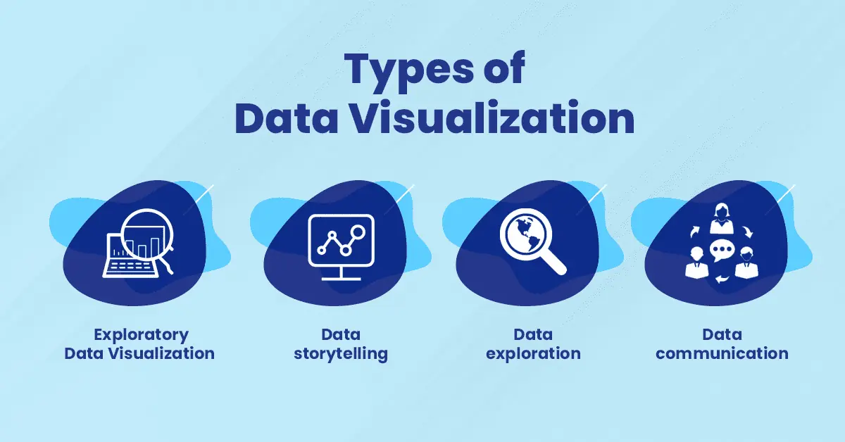
- Exploratory data visualization: This type of data visualization is used to gather information. The goal is to understand the data and its patterns, without any specific objective or hypothesis.
- Data storytelling: This type of data visualization is also exploratory, but it has a goal, usually to explain a complex topic or idea interestingly.
It may have multiple components that combine text with images to tell a story on screen, such as charts and graphs that show changes over time especially those that illustrate the change from one year into another.
- Data exploration: This form of visualizing involves gathering large volumes of information about many different things at once and then sorting through it all to identify trends, outliers, and other useful insights about the world around us.
- Data communication: This type of visualization will provide your audience with the complete context for interpreting your findings so they’re able to make informed judgments based on what they see.
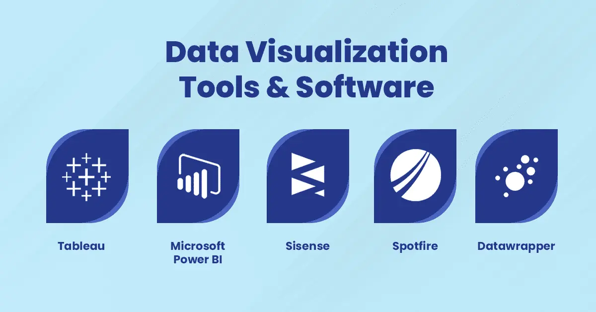
Data Visualization Tools & Software
Data visualization tools are valuable because they allow users to explore and understand their data in a way that would otherwise be impossible.
For example, if you’re trying to understand how customers interact with your product, you can quickly visualize how many customers have visited your website in the past week and what their behavior was like during those visits.
Data Visualization tools also help analysts make sense of large datasets by putting them into context with other related information.
For example, you may want to compare sales figures from the last 3 years to see whether this year’s numbers are up or down from previous years.
This kind of comparison is much easier with visualization software than it would be manually searching through spreadsheets or reports for each year’s figures.
1. Tableau
Tableau is a data visualization tool that allows you to create visualizations, dashboards, and reports from data you have in a variety of formats. A tableau is an excellent tool for creating interactive data visualizations and dashboards. Tableau also has some great features such as.
- Data blending – Tableau can blend multiple databases so that you’re not limited by one database’s capabilities. This makes it easy to combine different types of data without any unnecessary complexity or loss of quality when creating your analysis or dashboard.
- The ability to create interactive dashboards – You can incorporate forms into your report which allow users to interact with the content using their mouse cursor or touch on a mobile device (for instance) by tapping on certain elements within the dashboard itself!
2. Microsoft Power BI
Microsoft Power BI is a business analytics software that allows users to create and share data visualizations. It is part of the Microsoft Office suite of products and is available as a part of many plans offered by Microsoft.
Power BI is a cloud-based business intelligence tool that allows users to create, share, collaborate and visualize data through graphs and charts. The platform also offers predictive analytics by utilizing machine learning algorithms for the predictive analysis of business data.
3. Sisense
Sisense is a cloud-based business intelligence tool that allows users to visualize data and analyze it. This tool provides the ability to run predictive analytics on your data, allowing you to make better-informed decisions based on real-time insights.
Sisense’s platform makes it easy for users to build interactive dashboards using drag-and-drop functionality, no coding required. It also offers advanced reporting tools with robust built-in functions that allow users to create reports in seconds without any coding necessary!
In addition, Sisense has an open API so you can integrate data from other sources into the platform including Google Analytics and Salesforce CRM Software among others!
4. Spotfire
Spotfire is a cloud-based data visualization tool that has a wide range of features that allow you to create interactive reports and dashboards. Some of its most notable features include:
- Visualization tools like heatmaps, bubble maps, parallel coordinates, and even text analytics
- Interactive dashboards with over 100 different widgets available
- The ability to connect your data sources through APIs or ODBC connections.
5. Datawrapper
Datawrapper is a tool for creating charts and maps from raw data. It’s free to use, but you can also pay for a premium version. It’s easy to use and has a good range of options. Data can be imported from Excel or Google sheets, or you can upload it directly from your computer.
It supports a wide variety of data formats, including CSV (comma-separated values), XLSX (Microsoft Excel spreadsheet), SQL databases, and XML feeds. You can also import images and videos into your visualizations if needed.
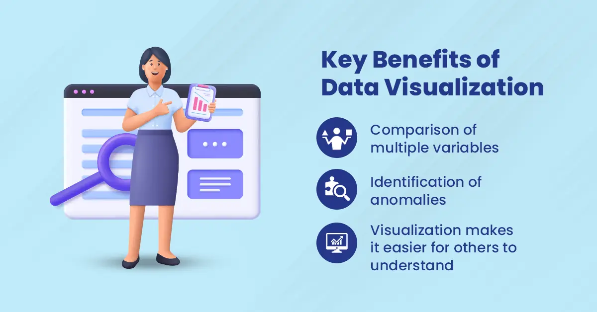
Key Benefits of Data Visualization
Data visualization is an increasingly important part of the business. It helps take the complexity of data and turn it into something easier to understand. They can help you make better decisions, whether you’re a CEO or an analyst.
Here are some of the benefits of data visualization.
- Comparison of multiple variables: Data visualization allows you to easily compare two or more variables at once. This is critical when you are looking for correlations between different factors in your dataset, like changes in sales over time versus demographic changes.
- Identification of anomalies: Data visualization can help you identify anomalies in your dataset. It may be caused by errors or other factors outside of what you were expecting. For example, if a particular region has an unexpectedly high number of customers with no purchases, this means there is something wrong with how those customers are being reported or classified by your system.
- Visualization makes it easier for others to understand: When visualizing your data, it becomes much easier for others who aren’t familiar with it to understand. It helps them understand what it means and how they should use it. Then they can read through rows of numbers or text-based reports on their own time!
Top Use Cases for Data Visualization
We’ll look at how they have created and the kinds of messages they communicate.
1) The Food Industry – Food truck menus are one of the most common forms of data visualization you’ll see in restaurants or food trucks around the world.
They’re designed to showcase the most popular items to the men. They also offer a quick snapshot of what kind of experience you’re about to have when you eat at that restaurant or food truck.
2) The Sports Industry – The sports industry is another major user of data visualization technology. This can range from fantasy football platforms that allow users to create their visualizations based on player performance stats.
It offers a platform where you can customize your team with other players’ stats from previous seasons so that your team’s performance looks better than it is (we’re not judging here).
Examples of Data Visualization
You can use data visualization to show how a certain event or trend occurred over time, and you can use it to show the impact of an event. Here are some examples.
- If you want to show the number of people who have signed up for your service over time, you could create a line graph that shows that data. That way, people can easily see how many new users have joined each month/year.
- If you’re trying to show how much money your company has made in the last five years, you could create a bar chart that shows this data on one axis and time on the other axis.
That way, it’s easy for people to see how much profit was made each year by comparing the length of each bar with its height (which would represent profit).
You can then create another bar chart that shows how much profit was made in each quarter of each year by comparing its length with its height (which would represent profit per quarter).
Future of Data Visualization
The world is changing. Thanks to the rise of technology and the accessibility of information, we’re living in a time when data is everywhere. We have access to more information than ever before, and it’s up to us to figure out how to use that information to make better decisions.
As companies become more reliant on data to make decisions about their strategies, the need for good visualizations becomes more pressing.
Data visualization will continue to be an important part of how we understand and interpret data. There are still many questions about how to make effective visualizations, but one thing is clear the future is bright for anyone who wants to get into this field!

Conclusion
Data visualization is a powerful tool for understanding data. In the past decade, there has been an explosion of data available online. Many companies have invested in technology to extract useful insights from their data sets, but it can be overwhelming if you don’t know where to start.
It provides a way for us all to understand data better by making it easier for us to digest and comprehend complex information quickly without having any prior knowledge about how this works.
FAQs on Data Visualization
Data visualization is the process of turning data into visual representations that can be easily interpreted. The goal of data visualization is to present information in a way that makes it easy to digest.
Data visualization can be used to make your work easier, save time, and communicate more effectively. It also allows you to make better decisions by helping you understand your data better.
There are many different types of visualizations, but you should use them whenever you want to get more information from your data.
For example, if you want to see how traffic patterns are changing over time or what people are doing on their mobile phones during the day (or night), then using visualizations will help you see those things more clearly than just looking at plain numbers would allow you to do!
To get started with data visualization, there are several things you can do:
– Use a tool such as a Tableau or Microsoft Power BI that allows you to visualize your data without having to code anything yourself.
– Learn about how the human brain processes visual information more efficiently than text and numbers alone
– Watch some tutorials on YouTube or attend a workshop on the subject
If you’re looking for someone who can help you with your project, we recommend checking our website. Get a Quote.
Here are some example charts.
Line chart: It shows how one variable changes over time or compares different variables at one time.
Bar chart: It compares groups of things by showing how much of each category there is within each group.
Pie chart: It compares parts of a whole by showing how much each part contributes to the whole.
Many different people use data visualization every day.
– Managers and investors use it when they need to understand how well their company is doing financially.
– Doctors use it when diagnosing patients; scientists use it when conducting experiments; educators use it when teaching classes.
And the list goes on!