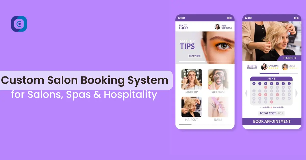
Data Engineering

Top 11 Data Visualization Tools and Software of 2024

Data visualization is one of the essential tools for every business. Data visualization tools help you make sense of your data and present it in a way that’s easy to understand. In this blog, we’ll run through some of the best-known data visualization tools on the market today, including Tableau, Qlik Sense, Sisense, and many more. 

What is Data Visualization?

Data visualization is the process of creating visual representations of data. It’s a powerful tool for understanding data, but also a challenge to create. As we stated earlier, there are various types of visualizations.  Each one serves its purpose. Here are some examples.

  • Heat Map
  • Table Chart
  • Scatter Plot
Data Visualization Services

What is Data Visualization Tool?

Data visualization tools are used to simplify information and make it easier to understand. The process of converting raw data into visualizations is called “data visualization”. The tools can be used in a wide variety of scenarios, including marketing and sales, communications and PR, operations management, business intelligence (BI), finance, sports analytics, and other areas where the analysis of large amounts of data is required. 

Top Data Visualization Tools and Software

1. Microsoft Power BI

Microsoft Power BI - Data Visualization Tool

Microsoft Power BI is a business analytics suite. The tool helps users visualize and understand data. It is a cloud-based analytics software allowing users to create interactive reports, dashboards, and visualizations. The tool has earned rave reviews from analysts because of its ability to support large datasets, its user-friendliness, and its competitive pricing structure. 

For beginners, Power BI provides great features such as auto-population of charts using machine learning algorithms as well as the ability to create basic charts, tables, or lists by simply dragging fields onto a canvas (thus eliminating much of the need for coding).

Power BI also has advanced features such as the ability for developers to build custom applications on top of it; however, this level of access requires some technical knowledge which may be difficult for newbies who have never worked with data before in their lives!

2. Tableau

Tableau - Data Visualization Tool

Tableau is a visual analytics software that allows users to explore, analyze, and visualize data. It’s used by more than 100,000 companies worldwide including 95% of the Fortune 500. Tableau is commonly used for real-time reporting and running ad hoc queries on large datasets, but it can also be used for data preparation and visualization.

Tableau’s user interface makes it easy to connect with other tools in your technology stack like Excel or RStudio. The platform has an open API that allows you to integrate Tableau into third-party applications as well. 

3. Qlik Sense

Qlik Sense - Data Visualization Tool

Qlik Sense is a cloud-based data visualization tool that allows you to create interactive reports and dashboards. Qlik Sense is pretty user-friendly and can be used by non-developers. It also has a variety of templates to choose from, which makes it easy for even beginners to get started with the software.

4. Data Wrapper

Data Wrapper - Data Visualization Tool

A data wrapper is a tool that allows you to import data from a source. Users can use that data in another app. It’s a way to work with data without having to download the files themselves.

See also  Data Lake vs Data Warehouse: What is the Core Difference?

For eg, you want to bring a file from an Excel spreadsheet into a word processor. If you already have the original file on your computer, then you can use the Data Wrapper tool to import it into your word processor (as long as it’s supported by that app). The tool is used in many industries and apps. 

  • In healthcare, they help ensure that sensitive patient information is secured.
  • In finance, they allow for rapid communication between different trading platforms.
  • In Business intelligence, it provides a way for companies to analyze their data.

5. Plotly

Plotly

Plotly is a data visualization tool that allows you to create charts, maps, and dashboards. It is free and open source, so it can be used by researchers, data analysts, and data scientists. A few of its features include, 

  • Interactive visualizations that users can edit in real-time
  • Exportable shareable link
  • Built-in collaboration tools

6. Sisense

Sisense

Sisense is a cloud-based business intelligence software that enables users to make better decisions with their data. It provides the ability to visualize, analyze, and model any type of data from any source through an intuitive interface. You can also compare your results against benchmarks or industry trends by using interactive dashboards.

Sisense supports all types of visualizations including charts, tables, gauges, maps, and more. With these tools, you can instantly explore your data in interactive ways such as drill-down/drill-through visualization which allows you to click on one area of a chart to see another chart underneath it. The software also comes with prebuilt reports that allow you to easily create a variety of analytics documents such as scorecards and dashboards. 

7. JupyteR

Jupyter

Jupyter Notebook is a web app that allows users to create and share documents that consist of live code, equations, visualizations, and explanatory text. It is an open-source project developed in the Python programming language. 

Jupyter Notebooks are commonly used in data science as well as machine learning because they allow users to easily display results from code in real-time. Jupyter Notebooks also include other features such as syntax highlighting, code completion, and inline plots that make writing code faster and more intuitive than typing alone.

8. IBM Watson

IBm Watson

IBM Watson is a suite of APIs, services, and cloud-based solutions that harness the power of cognitive computing. IBM Watson is a cloud-based solution that can be integrated into your existing applications to help you discover new insights, gain faster access to critical information, and solve problems more effectively.

IBM Watson helps users input parameters into its algorithms so they can see how these changes affect output results while they’re still developing their models – which makes it very useful especially when analyzing new companies’ performance using historical sales records or other similar types of financial information related findings.

9. Highcharts

Highcharts

Highcharts is a JavaScript charting library that allows users to create engaging charts, maps, and floor plans. It is free and open source. It is used by many companies, including Facebook, Twitter, Netflix, and LinkedIn. 

The library supports all modern browsers and also has a mobile version for iOS devices (iPhone/iPad). Highcharts can be used on the server side with NodeJS or Ruby on Rails frameworks. 

See also  Top 15 Data Visualization Examples of 2024

10. Fusioncharts

FusionChats

FusionCharts is a JavaScript charting library used for web apps. It was launched in 2002 by a group of software engineers from India, the USA, and Poland. FusionCharts has a variety of charts that can be used to visualize your data including bar charts, pie charts, line charts, etc. 

11. Zoho Analytics

Zoho Analytics

Zoho Analytics is a cloud-based business intelligence software that allows users to create interactive reports, dashboards, and visualizations. Its features include,

  • A variety of chart types with built-in templates
  • Interactive widgets to publish on your website
  • An API for developers to build custom solutions

Zoho Analytics is great for beginners and experienced users alike. It’s also ideal for small businesses looking for an easy way to visualize their data in different formats.

How to Choose the Right Data Visualization Tools?

With the rise of data visualization, it’s important to know what tools and software are available to you. Here are some tips for choosing the right tool or software. 

1. What’s your budget? Do you want to spend a lot on the software, or are you okay with something less expensive?

2. How much training do you need? If you’re just starting, you might want a product that comes with some training materials or support services.

3. What kind of data will you be working with? You might need a different visual representation depending on whether your data is numerical or categorical (or even both).

Data Visualization Services

Ending Notes

Data visualization tools are an important part of the analysis process and can help you find previously hidden insights in your data. As we’ve shown here, there are a lot of options out there for every budget and level of expertise. 

If you’re testing data visualization tools for learning purposes, you can utilize free tools instead of paying for software testing.

But remember that even if you don’t have access to expensive software, you can still create charts using Excel or Google Sheets or even by hand!

FAQs for Data Visualization Tools & Software

How does data visualization help with data analysis?

Data visualization helps you see patterns in your data. You will be able to see trends, outliers, and relationships. It is also a great way to organize your data into different categories and compare different variables.

Data visualization allows you to see what is important, and what is not important in the data set (for example, if there are missing values).

It allows you to explore the options available for analyzing data visually before deciding on which software tool or method would be best for this task.

Which is the best data visualization tool for beginners?

If you are a beginner, it is best to start with a simple tool. Check out the list of tools below.

Tableau: A tool for data visualization and analysis that allows users to create interactive dashboards with intuitive drag-and-drop features.

Google Sheets: A spreadsheet-based app that allows users to create dynamic reports and presentations using their data.

Data Studio: The free cloud-based reporting platform created by Google that allows users to easily create reports from various sources of information (including spreadsheets, databases, etc.).

Which is the best data visualization tool for marketing?

Tableau is the best data visualization tool for marketing because it is easy to use and it is very powerful. Tableau can be used by both beginners and advanced users. It allows you to create beautiful, interactive data visualizations in minutes. Tableau is also very affordable; you only need to pay once per user per month!

See also  What is Data Visualization? A Complete Guide in 2024
How can I find free online data visualization tools?

If you’re just getting into data visualization, or if you’re on a tight budget, free online tools are an excellent way to get your feet wet. These tools are also great for testing designs and prototypes before investing in a paid product.

As you start with these freebies, you may find that they don’t have all the features or capabilities that your project demands. If this happens, keep looking around until you find something more suitable.

What are the best data visualization techniques?

Data visualization is a process that converts data into a graphical format. Data visualization helps simplify complex information and make it easier to understand by using visual representations of the data. It’s used as a communication tool to help people make sense of large amounts of information quickly and easily.

Can I use Excel to create infographics?

Yes, Excel is a good tool for creating infographics. When you use Excel to create infographics, you will have access to many of the same features that other data visualization tools and software offer. Some of these include:
– The ability to create data visualizations with charts and graphs
– The ability to use formulas in your data visualizations
– The ability to easily connect one chart or graph up with another chart or graph on different sheets

If you are looking for a way to make it easy on yourself when creating infographics, then using Excel may be just what you need.

Where can I find a list of the best data visualization tools?

You can find a list of the best data visualization tools by doing an internet search. Some data visualization tools are free, while others require payment. Many data visualization tools are designed for specific industries, such as healthcare and education. Others are designed for specific tasks, such as creating infographics or dashboard reports in PowerPoint presentations that you can use at work or home.

Is there a need for top-notch graphical design skills in data visualization projects?

Yes, definitely. The reason this question is asked so often is that a high-quality design can make or break your data visualization project. If you don’t have the skills to create beautiful graphics and infographics, it’s best to partner with someone who does.

You want your infographic to be clean and simple so that users can easily understand what they’re looking at. You also want it to look consistent with your brand (for example, if your product is for children, then don’t use too many dark colors). When designing an infographic for data analysis purposes, remember that simplicity will allow viewers to focus more on the information being presented rather than getting distracted by complicated graphics or fonts.

A good rule of thumb for creating infographics is: “Graphs are like leaves; stories are like branches.” This means that you should focus on the main point(s) of your story first before adding additional details such as graphs/charts/etc., which will help keep things organized throughout the entire process.

    Need an IT Experts? Get a Free Consultation!

    lets start your project

    Related Articles